Broken Coast
Problem
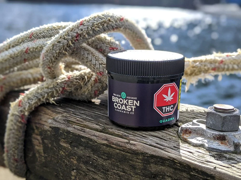
Ahead of cannabis legalization in 2016, Broken Coast needed a brand refresh to clearly distinguish their medical offerings from their recreational line. They aimed to build on their premium cannabis reputation while capturing a new audience that appreciated the essence of West Coast cannabis.
Solution
We designed a new wordmark inspired by the hand-painted lettering found on boats, evoking a sense of heritage and trust. This was paired with a graphic language incorporating nautical elements, highlighting the unique experience of cultivating cannabis on B.C.’s Gulf Islands.
Deliverables
Brand Identity 〰️ Website 〰️ Social Media Strategy 〰️ Photography 〰️ Environmental Design 〰️ Video Production 〰️ Packaging Design
Credits
Katherine Patton / Design
Matt Webb / Design