-ness
Problem
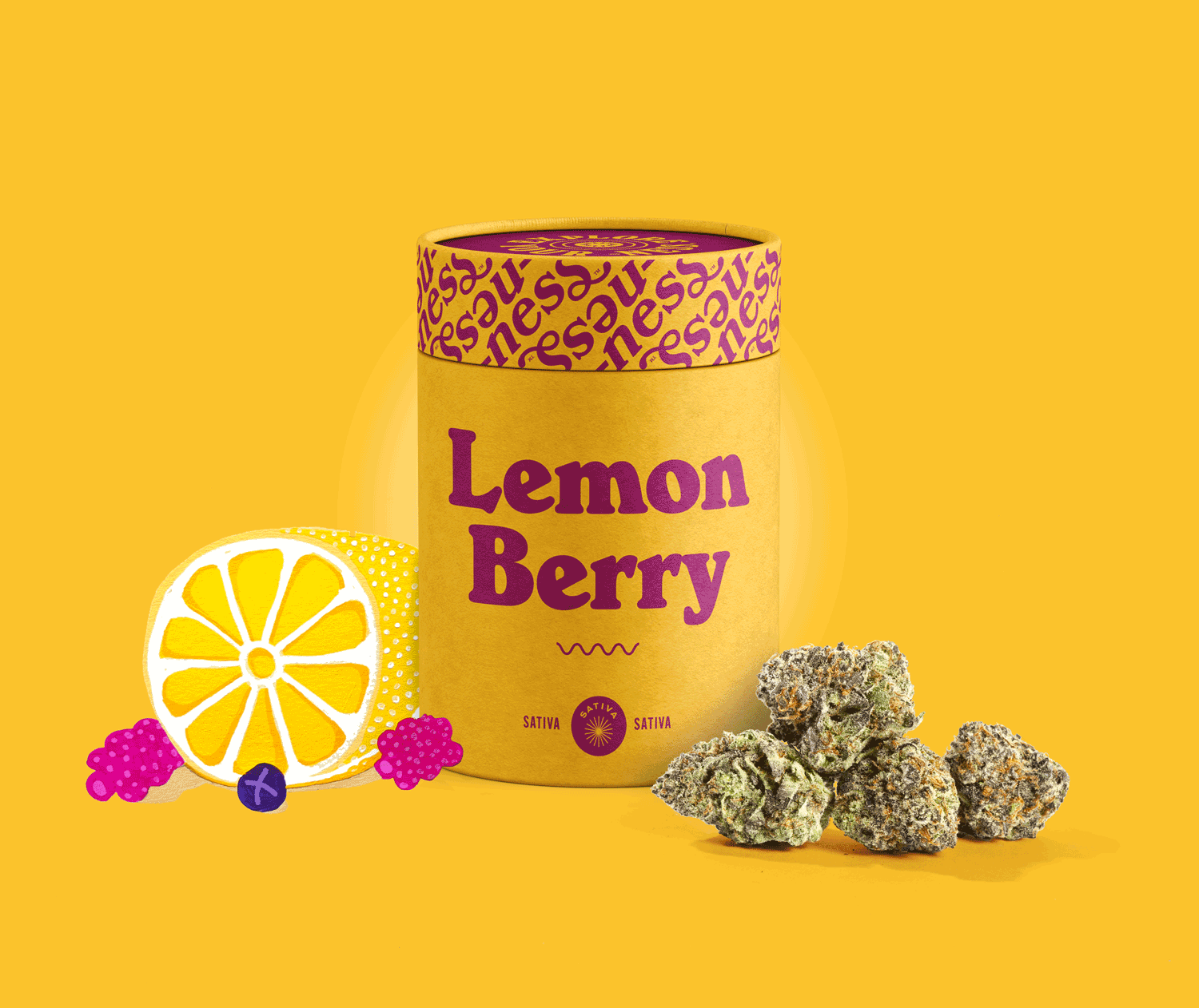
-ness wanted an identity system that expressed how cannabis can enhance creativity and your life. The goal was to convey wellness without falling into “live, laugh, love” clichés or feeling disingenuous. Something that would stand out in a saturated market and was oozing with personality.
Solution
We blended 60s-inspired typography with a warm, nostalgic color palette and crafted imagery that celebrated unique-ness, happi-ness, snazi-ness, delicious-ness—you get the idea. Original hand-painted illustrations and pattern designs highlighted creativity, while a fresh twist on flower power brought it all to life.
Deliverables
Brand Identity 〰️ Website 〰️ Illustration 〰️ Motion Design 〰️ Social Media Strategy 〰️ Photography 〰️ Environmental Design 〰️ Video Production 〰️ Packaging Design
Credits
Katherine Webb / Design
Adam Lang / Development
Gabriel Cabrera / Photography
Chris Li / Design
Nick McDonald / Design
Jessica Grajczyk / Copywriting